Background
At work, we’ve been focusing on building components that are reusable and more flexible throughout our application. Because of this, we’ve been focusing on making components more composable. To really drive that point home, I gave a small presentation using an awesome library called Code Hike.
If you haven’t seen Code Hike before, you should definitely stop right here and at least give Rodrigo Pombo’s (the author of Code Hike) amazing article on Build Your Own React a quick look.
While this library is great, there is one unfortunate downside, it isn’t well documented 😞. To help out with that though, I figured I’d write a tutorial on how to create a presentation using Code Hike!
In this tutorial, we’ll show how to setup a presentation using React and CodeHike, which will look something like this:
Setup
The first thing you’ll want to do is start a React project. The simplest way would be to start with create-react-app.
$ yarn create react-app codehike-tutorialFrom there, you’ll want to install the following dependencies:
- @code-hike/mini-browser - The brower component for our presentation distributed as part of @code-hike.
- @code-hike/mini-editor - The editor component for our presentation.
- theme-ui - A dependency required by Code Hike.
- use-spring - A minimal library built by Rodrigo Pombo for spring animations.
$ yarn add @code-hike/mini-browser @code-hike/mini-editor theme-ui use-springNow that we’ve got that all setup, we can start with writing our presentation!
The Mini Editor
The Code Hike library ships with a few components, one of those being the Mini Editor. The Mini Editor displays an editor-like window with the content being the code you want to show.
To get started, lets import and render the Mini Editor. If you started with a
create-react-app application, you can simply edit the App.js for this tutorial.
import { MiniEditor } from "@code-hike/mini-editor";

function App() {
  const editorStyles = { width: "600px", margin: "10px", height: "400px" };
  return (
    <div className="App">
      <MiniEditor style={editorStyles} />
    </div>
  );
}

export default App;
This renders the following Mini Editor for us:
Not terribly exciting, but hey, it’s a start 😊
So let’s try to get this ball rolling. If you take a look at the MiniEditor props you’ll see that a couple of interesting properties pop out.
Let’s walk through a few of the ones we’re going to use and see what they’re meant for:
steps- An array of MiniEditorStep objects which define the different steps the MiniEditor shows.progress- The step index to renderbackward- A boolean indicating whether we’re retracing our steps
Now that we have someone of an idea of what we want to show, let’s try to render some code in our Editor.
To do that, let’s start by defining some steps as MiniEditorStep objects.
A MiniEditorStep has the following properties:
code- The code we want to render as a stringlang- The language of the codefile- The file name to display in the tabtabs- An array of strings to display as tabs
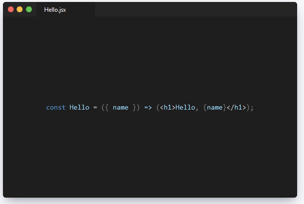
Let’s start with something simple. Let’s create a Hello component which accepts a name
and renders an h1 greeting the provided name:
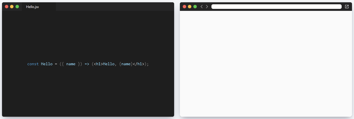
const Hello = ({ name }) => (<h1>Hello, {name}</h1>);Let’s have MiniEdtor display this code. To do that, we’ll define our first step:
import { MiniEditor } from "@code-hike/mini-editor";

const Hello = ({ name }) => (<h1>Hello, {name}</h1>);

function App() {
  const editorStyles = { width: "600px", margin: "10px", height: "400px" };
  const editorSteps = [
    {
      code: `const Hello = ({ name }) => (<h1>Hello, {name}</h1>);`,
      file: 'Hello.jsx',
      lang: 'javascript',
    }
  ]
  return (
    <div className="App">
      <MiniEditor
        style={editorStyles}
        steps={editorSteps}
        progress={0}
      />
    </div>
  );
}

export default App;
We now get our code rendered in the editor:
Okay this is cool and we’re starting to move forward.
MiniBrowser
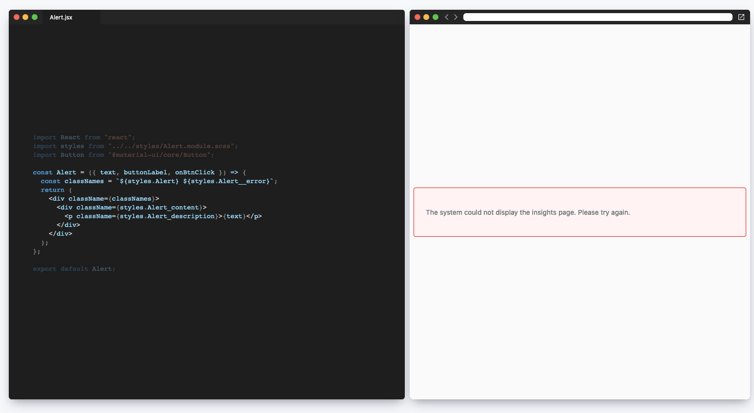
Let’s add a MiniBrowser component, which we can use to render our elements side by side with our code.
import './App.css';
import { MiniEditor } from "@code-hike/mini-editor";
import { MiniBrowser } from "@code-hike/mini-browser";

const Hello = ({ name }) => (<h1>Hello, {name}</h1>);

function App() {
  const styles = { width: "600px", margin: "10px", height: "400px" };
  const editorSteps = [
    {
      code: `const Hello = ({ name }) => (<h1>Hello, {name}</h1>);`,
      file: 'Hello.jsx',
      lang: 'javascript',
    }
  ]
  return (
    <div className="App">
      <MiniEditor
        style={styles}
        steps={editorSteps}
        progress={0}
      />
      <MiniBrowser style={styles} />
    </div>
  );
}

export default App;
Throwing in the MiniBrowser with the same styling. I also added some simple properties to
render the elements of the .App div side by side.
Our MiniBrowser accepts very similar props as the MiniEditor with a slight change to the its step type.
Looking at the MiniBrowserStep, here are some of the props we’ll be using:
url- The url to display in the browserchildren- A prop which acceptsReact.Nodeto be rendered inside theMiniBrowser.
Let’s give this a shot!
import './App.css';
import { MiniEditor } from "@code-hike/mini-editor";
import { MiniBrowser } from "@code-hike/mini-browser";
const Hello = ({ name }) => (<h1>Hello, {name}</h1>);
function App() {
const styles = { width: "600px", margin: "10px", height: "400px" };
const editorSteps = [
{
code: `const Hello = ({ name }) => (<h1>Hello, {name}</h1>);`,
file: 'Hello.jsx',
lang: 'javascript',
}
];
const browserSteps = [
{
url: 'http://localhost:8000',
children: (
<Hello name="m8" />
)
}
];
return (
<div className="App">
<MiniEditor
style={styles}
steps={editorSteps}
progress={0}
/>
<MiniBrowser
style={styles}
steps={browserSteps}
progress={0}
/>
</div>
);
}
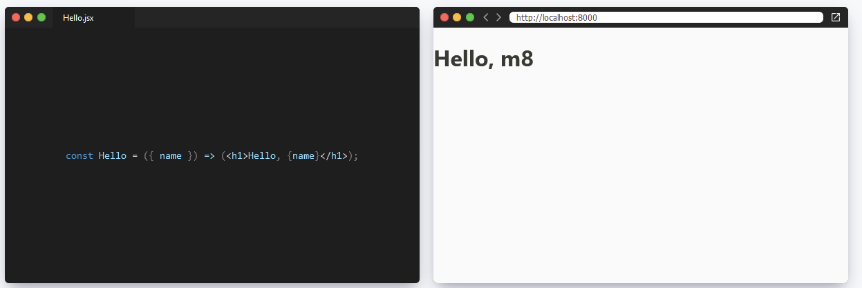
export default App;In the above snippet, we’ve made the following changes:
- Created a
browserStepslist which has a single step.- The step renders uses our
Hellocomponent to render in the browser window.
- The step renders uses our
- Updated the JSX declaring the
Hellocomponent to include thestepsandprogressprops.
We can now render our code and the component side by side:
Adding More Steps
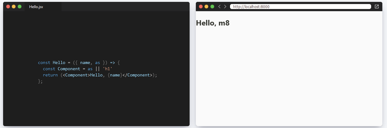
After some back and forth, we feel that the h1 seems to be just a little too loud. We’d
like to tone down our greeting in certain cases. To support this use case, let’s update our
Hello component so that it accepts a component to use when rendering the greeting.
const Hello = ({ name, as }) => {
  const Component = as || 'h1'
  return (<Component>Hello, {name}</Component>);
};
Let’s render a new step showing how to use the as prop.
We’ll start by creating a new editor step where we’ll copy our Hello component into as a
string.
const helloWithAsProp = `
  const Hello = ({ name, as }) => {
    const Component = as || 'h1'
    return (<Component>Hello, {name}</Component>);
  };
`;

const editorSteps = [
  {
    code: `const Hello = ({ name }) => (<h1>Hello, {name}</h1>);`,
    file: 'Hello.jsx',
    lang: 'javascript',
  },
  {
    code: helloWithAsProp,
    file: 'Hello.jsx',
    lang: 'javascript'
  }
];
We’ll then update our browserSteps to include a new step using the new prop:
const browserSteps = [
  {
    url: 'http://localhost:8000',
    children: (
      <Hello name="m8" />
    )
  },
  {
    url: 'http://localhost:8000',
    children: (
      <Hello name="m8" as="h2" />
    )
  }
];
Let’s test this out by setting our progress value to 1.
Transitioning between Steps
Looks like we’re getting closer. Let’s add a way to transition between steps. This is really up to you as the user of this presentation.
The first thing that I did was sync up the steps between the MiniEditor and the MiniBrowser. Depending on how you’re writing your steps, you may not have a 1:1 relationship between editor and browser steps. Feel free to experiment with what fits your needs best here.
To start, I keep track of the stepIndex using the useState hook:
const [stepIndex, setIndex] = React.useState(0);We can then write some pretty simple functions to go to the next and previous slides:
const nextSlide = () => {
  const nextIndex = stepIndex + 1;
  if (nextIndex < editorSteps.length) {
    setIndex(nextIndex);
  }
};

const prevSlide = () => {
  if (stepIndex > 0) {
    setIndex(stepIndex - 1);
  }
};
Nothing terribly exciting to see here.
Since I was screen sharing while giving mine, I decided I’d want to be able to transition between steps by pressing the left and right arrow keys. Since I was putting this together rather quickly, I settled on using react-use-keypress.
While this library is a little obscure and I totally understand not wanting to pull in yet another dependency. There is a nice little guide on writing your own useKeyPress hook.
Using react-use-keypress is fairly simple, we can just specify the ArrowLeft and ArrowRight
keys to listen to:
useKeypress(["ArrowLeft", "ArrowRight"], (event) => {
  if (event.key === "ArrowLeft") {
    prevSlide();
  } else {
    nextSlide();
  }
});
We can now pass our stepIndex to as the progress prop to our MiniEditor and MiniBrowser
this should allow us to use the left and right arrow keys to go through steps.
If you give this a shot, you’ll notice that while our steps do change, we don’t get any of the fancy animations (which I’m sure woo’d us when we saw Rodrigo’s blog). This is because the animations are handled by making a progression of our steps.
To help with that, Rodrigo has implemented yet another library, called use-spring.
We can use the useSpring hook which accepts a number and a configuration object
which we can tweak to adjust how our animations render.
Given that I’m not very clever, I simply just copied the settings from Rodrigo’s “The X in MDX” presentation.
const [progress] = useSpring(stepIndex, {
  decimals: 3,
  stiffness: 80,
  damping: 48,
  mass: 8,
});
Passing the progress value to our components now gives us a nicely smooth transition between
steps.